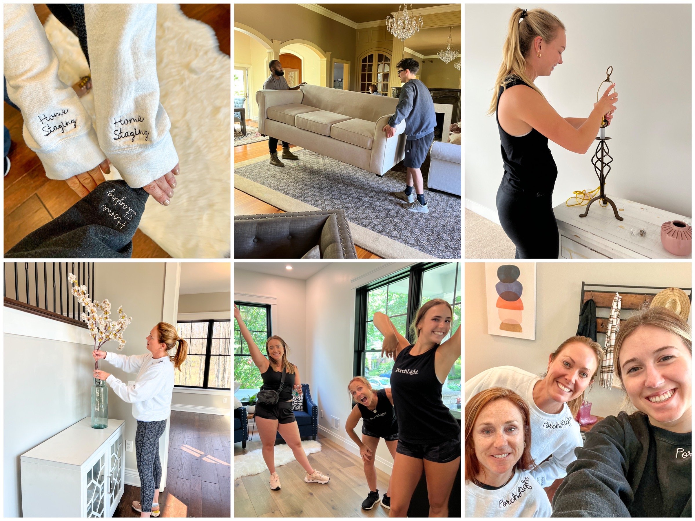
All About Online Shopping

Hi There!

We are PorchLight Home Staging popping on to welcome you back to our blog. The way this blog thing works is that on the first Friday of every month, we will celebrate the much needed weekend by releasing our monthly blog. In these short but sweet articles, we will mesh the world of home staging (our forte) with current events and fashion trends. Before we get started, we wanted to let you know that we are taking a hiatus from the monthly blogs! For our last topic, we only found it fitting to further promote and familiarize our customers with our online shopping capabilities as well as give you some facts on the world of online shopping. We may be biased, but this info is super helpful and can serve as a tool to read up about the new things PorchLight is doing…

The Gravity of Online Shopping

We all know the effects and advantages to online shopping: convenience, instant gratification, etc. But let’s talk about the platforms who have really jumped on this opportunity and help companies (like PorchLight) give our customers personalized and easy shopping experiences. We know looking for furniture and decor for your space can be a daunting task, so we want to act as your personal shoppers to mitigate any stress. According to the government census, The first quarter 2023 e-commerce estimate increased 7.8 percent (±1.6%) from the first quarter of 2022 while total retail sales increased 3.4 percent (±0.4%). This apparent growth just further confirmed that our company needed to be a part of this online space. Online shopping is the way to go for these tasks because you can read thousands of trusted reviews, explore hundreds of options without leaving your home, and easily purchase items at the click of a button. So what platform are we using to help you with this?

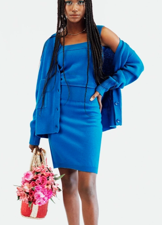
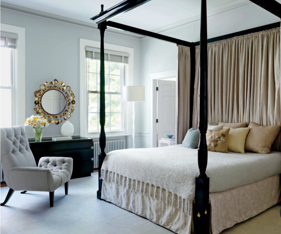
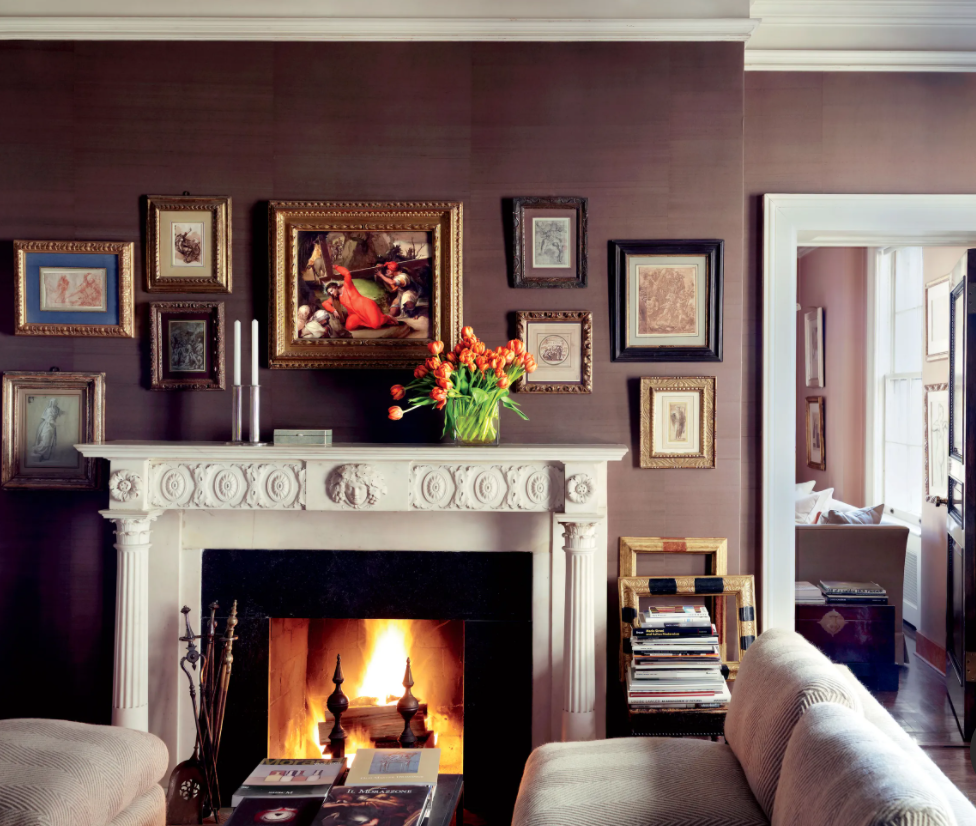
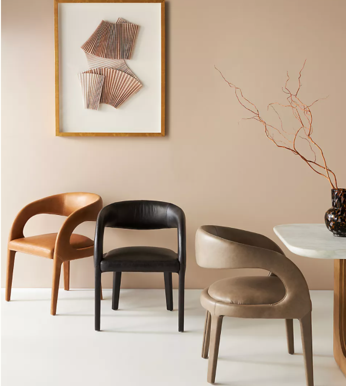
Like To Know It (LTK)

In 2014, Amber Venz Box, launched LIKEtoKNOW.it after years of exploring other entrepreneurial routes (can someone say “girl boss??”). The service makes it possible for users to buy merchandise that they see their favorite Instagram influencers wearing. When a shopper likes a picture on Instagram or clicks on a linked product, they are transported to LTK’s website and the personal page of said influencer which hosts more links leading the shopper to where they can buy the item they liked. Since 2014, shoppers have purchased more than $250 million in merchandise via the LTK service!

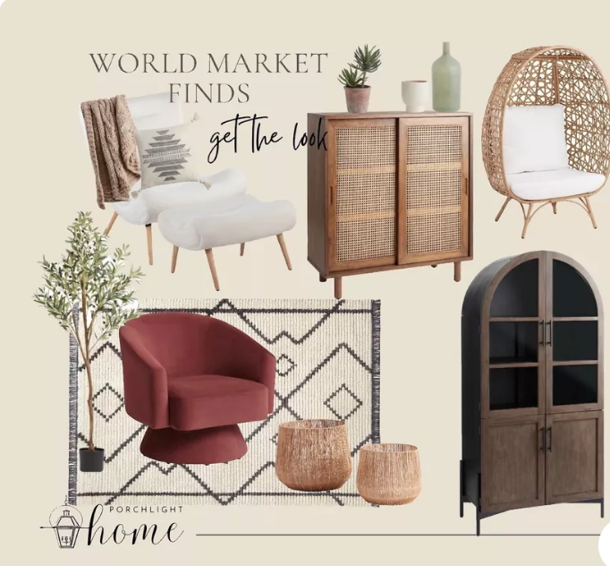
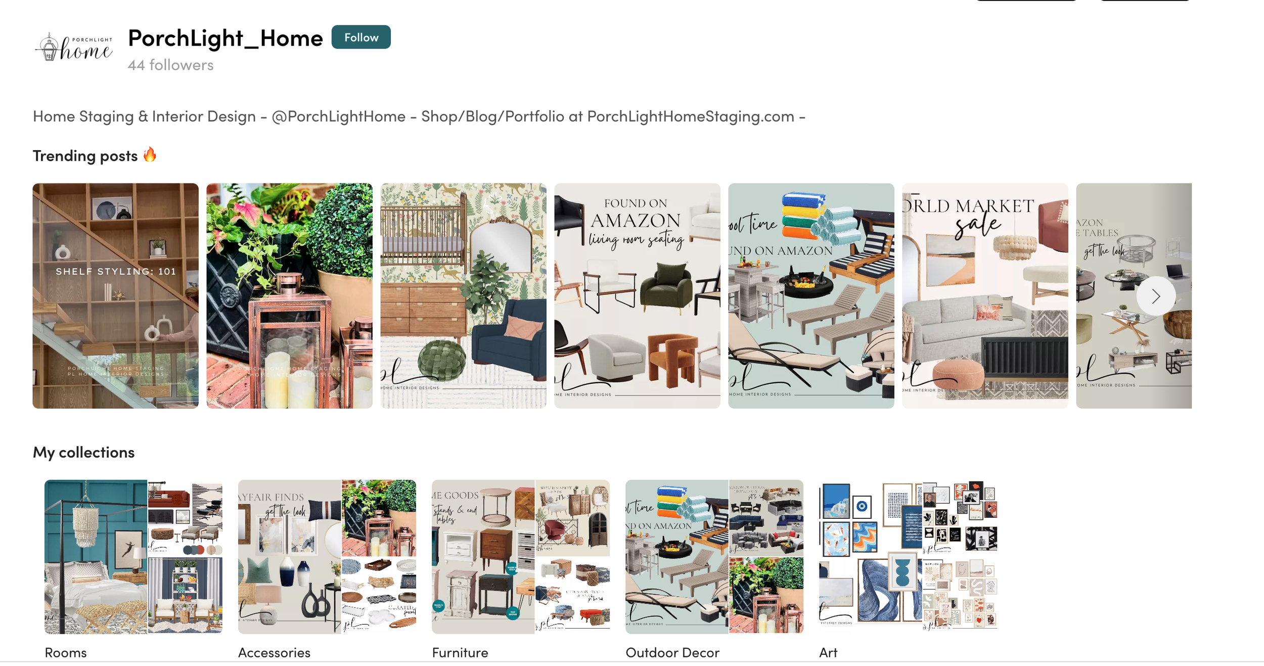
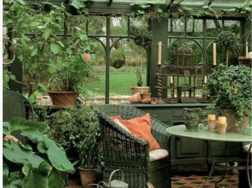
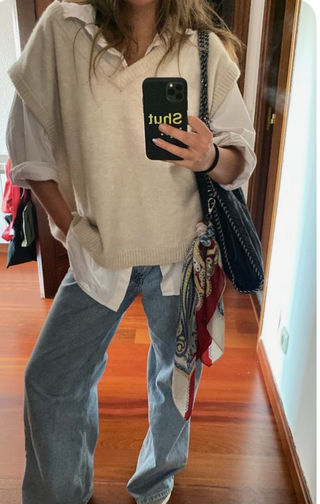
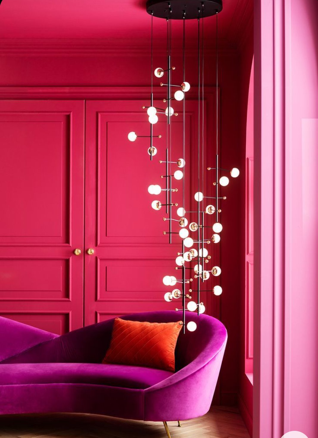
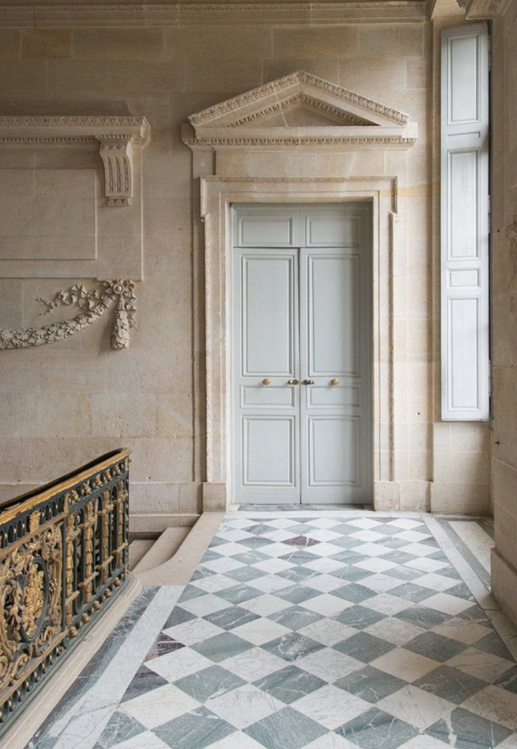
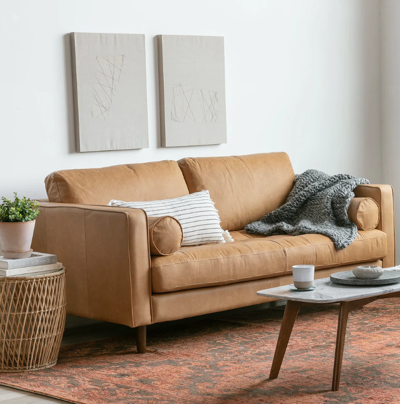
Examples of our LTK boards

How Can You Access Our LTK?

Easy! Go to our home page where we offer multiple different links into our company whether that be our home staging services, our online store (LTK page), home interior design expertise, blog, or a boards with the current looks we love. In order to access our shopping boards, you would click shop our online boards. You should be directed to this page shown below. We love this service and are so excited to bring it to you. Happy shopping!

Share

The Future of Home and Lifestyle

Hi There!

We are PorchLight Home Staging popping on to welcome you back to our blog. The way this blog thing works is that on the first Friday of every month, we will celebrate the much needed weekend by releasing our monthly blog. In these short but sweet articles, we will mesh the world of home staging (our forte) with current events and fashion trends. For this month’s edition, we dive into the company, Fashion Snoops. FS is a global trend agency that services brands, retailers, and manufacturers. Every year, they conduct webinars that share trends they predict to see and display how some brands are ahead of the curve by implementing these elements into their brand. We are going to focus on home and lifestyle trends this month, as the home is now called “the center of human care.” Big deal, right? We think so! We will break this blog down into 6 different categories/trends.

Neuroaesthetics

This is the study of how colors, textures, and shapes in a room can have an effect on a person’s sense of well-being. In some ways, this is simple – curved contents are more calming than sharp rectangle shapes. But, this impacts design so much more. Decorators are looking for elements now that trigger all the 5 senses. This changes throughout your rooms in your home. For example, your bedroom should feel calm, while your office should feel creative or productive. Currently, Bala, an athleisure brand, stores incorporate decor that is fun and active. Their store is like a “colorful playground of physical and visual stimulation.” Next, industry leaders are looking to create more inclusive architecture for neurodivergent (ADD, OCD, ADHD, etc) customers. Spaces like offices, hospitals, and schools are being designed with more thought and care. Once they check the boxes off of the logistical designs (acoustic control, lighting), they can get creative with cool seating and technology.

Hospitality

Wellness travel has become one of the industry’s fastest growing sectors, as there is an uptick in travelers looking for restorative retreats. They are looking to take back new inspirations and learning elements to take back with them when they return to their normal life. Hospitality environments have adapted new elements and amenities to cater to this demand. If you haven’t noticed already, hotels and airbnbs are putting more effort into decor due to this trend. Next, unethical tourism is at an all time high focus. Responsible guest activities are a reality that travelers are taking into account. For example, people visiting the archipelago of Palau are required to sign the “Palau Pledge.”

Serene Solitude

Because of an increase in tech, the human brain has evolved to seek out the company of others thus resulting in a rising heart rate, high blood pressure, and stress levels when we sense feelings of loneliness. At first, this was scary. Now, consumers are debunking this, and are choosing time alone. Now, a projected 1 in 4 millennials are predicted to not “tie the knot.” We are seeing a lot of spaces that are designed for an individual and their work rather than a seating area for a group of people. Consumers look for ways to “solo escape.” Honjok, a Korean idea that translates to, “alone tribe,” really encompasses this idea. Taking time to be alone enhances mindful and spiritual practices. So how does this affect your personal space? This is leading to “scaled-down” designs. Products that focus on group activities such as cooking, are pivoting to offer options for a smaller more personal consumer (ex: dining sets for 2, smaller pots, etc.) Other corners of the industry such as bathing or skincare are doing the opposite. 

Connected to Comfort

The rise of the connected home is happening at a time where consumers are saying they crave less tech in their lives. Sounds contradicting, but we humans are complicated. These home tech tools are created to blend in the background of our lives by creating more efficient solutions. This is for the ultimate convenience while remaining discrete. “Calm tech” is the new way of thinking about it rather than clunky, light-up robots in your home. Smart sensors, speakers, security cameras, or thermostats are being created to blend into your space. With that, consumers will demand connected convenience or a “smart ecosystem.” In this idea, the smart devices would communicate and work together under one network. Ideally, this will be regardless of brand or age of tech. So what you buy can work with what you’ve had. How? The Matter Protocol. This is the standard set or requirements that will pioneer these advances. Currently, The Matter Protocol works with home security, lighting products, blinds, TVs, and more. Lastly, data-powered tools are a priority. This means that any gadget will work with you as it gets to know you. For example, mattresses will track your sleep cycle and how your body moves to provide you with a more comfortable and well-rounded rest. 

Circular Home

This is the idea that low-waste lifestyles will decrease our footprints. One method of reducing our footprint is by going “zero waste.” Gen Z are more attuned with this. Secondly, design communities will join the biomaterial revolution. Using other elements such as hemp, cork, algae are pioneering these sustainable materials. Lastly, supporting self-reliance will empower consumers. Consumers are looking at composting, gardening, rain harvesting, and other skills that allow home ownership to become autonomous. This means all you need to live can be found on the home’s site. Architects are getting super creative around these ideas. 

Modern Craft Care

A strong focus has been placed on the intangible uniqueness of hand-made goods. When else in history could you order specialized tools and receive them a few days later with instructions on how to make it yourself? These traditional techniques are being updated with technology. This opens the door to revive traditional techniques and add onto them with 3D printing, AI, and more. On top of this, consumers prioritize longevity in design. Buy-back and repair services are gaining a lot of momentum now. This will give consumers the most out of every purchase. Finally, creating mindful crafts allows for mindful healing. Hobbies can be super healing and help with stress and depression just by completing the act, but it also helps when you give someone a gift.

Final Thoughts

That was a lot, we know. Trend predicting is one of the more fun things we research here at PorchLight, and it allows us to stay up-to-date with an every-changing industry. We hope this was interesting and got your brain thinking about where you may see these micro-trends in your daily life. The world is changing and we have to keep up!

Share

Buzz with The Boss

Hi There!

We are PorchLight Home Staging popping on to welcome you back to our blog. The way this blog thing works is that on the first Friday of every month, we will celebrate the much needed weekend by releasing our monthly blog. In these short but sweet articles, we will mesh the world of home staging (our forte) with current events and fashion trends. For this month’s edition, we hear from Boss-woman, Betsy. Over the past few months, we have gained some new clients and followers (Welcome!). With that being said, we wanted to go over the staging process and more about our business!

Q: What is your favorite part of the staging process?

A: I love seeing the transformation of a room. Seeing a house and the spaces in it come to life is so rewarding and makes all the blood, sweat, and (sometimes) tears worth it!

Q: What is something you were surprised to find about the staging process?

A: I am continually surprised by how different each home is. They are all so unique and have their own story and character. Contrary to modern-day housing developments, I don’t see any house as a replica or “cookie-cutter.” Each house and room requires something unique and different.

Q: What is something you could not do without on a staging day?

A: So many things! Definitely the huskies! We use these every staging day, and we’d be lost without all the little tools inside. We always need a speaker because what is a long day of work without some Dua Lipa? And water… hydrate or die-drate

Q: What is something you wish homeowners knew before bringing a staging company in?

A: Staging is not interior design. Sometimes a certain way we position is a chair is not for functionality, but rather to catch a buyer’s eye when they are walking through the space. Our job is to create a look that appeals to as many potential buyer’s as possible, not for one individual!

Q: How do you see PorchLight’s Smart Shopping, E-Design, and LTK links helping your customers?

A: People are constantly asking me where we buy our inventory or how to get the “PorchLight Look.” We are always doing research on the latest trends and styles and we really enjoy making boards. these available to our customers. It is so easy to click and shop via our links. We are so excited for the future of smart shopping!

Q: What are you looking forward to most about the staging industry & Pittsburgh real estate?

A: The Pittsburgh market it HOT & desirable. We have seen a huge migration of people all ages, socio-economic statuses, and demographics moving to the area. I touched on how unique the houses are, but the potential buyer’s are all different too! This forces PorchLight to remain dynamic when appealing to different neighborhoods. The team and I love this part of our job!

Share

APRIL BLOG: Spring/Summer 2023 Trends

Hi There!

We are PorchLight Home Staging popping on to welcome you back to our blog. The way this blog thing works is that on the first Friday of every month, we will celebrate the much needed weekend by releasing our monthly blog. In these short but sweet articles, we will mesh the world of home staging (our forte) with current events and fashion trends. For this month’s edition, we will dive into spring and summer trends for 2023. Trend forecasting is alwa

Share

Affordable & On Trend Fashion

Hi There!

We are PorchLight Home Staging popping on to welcome you back to our blog. The way this blog thing works is that on the first Friday of every month, we will celebrate the much needed weekend by releasing our monthly blog. In these short but sweet articles, we will cover part 2 of our affordable articles: fashion. We know the feeling when you see one of your favorite influencers modeling a fabulous get up that you need to get your hands on. When you click the link provided, a chill runs down your spine as just one of the pieces is about double your last paycheck. Just me? Whether you’re a broke college student or just want to look on trend on a budget, this month’s blog is for you. Keep in mind that all of these trends are coming from various fashion forward company’s runway shows, and from there, we pick our favorite elements that we predict will make it down to mass acceptance and fast fashion.


Now, Before we get started, I want to share a tip that I have implemented into my online shopping efforts (or obsession) that makes the whole process a little less daunting and will help you avoid sifting through 76 websites looking for a purple dress. Create a note on your phone with Categories and under each catergory, put about 5-10 websites of styles and price points that match yours. So when the time comes to search for an item, you already know what websites to head to first for each desired item. For example:

Category: formal dresses

  • store 1

  • store 2

  • store 3

  • store 4

Category: heeled sandals

  • Sam Edelman

  • Steve Madden

  • DSW

  • ASOS

Perfectly Imperfect

We are seeing a lot of styles that evoke a sense of “unfinishedness.” This is a classic way to tie down a piece to make it more casual whilst still remaining fashionable and on trend. We see a lot of these “happy mistake” pieces in pattch work, frayed jeans, and mesh tops. This is definitely a trend to look out for.

Images: Zara, Free People, SSense, Princess Poly


Moto Leather

Obviously, leather is not new to the fashion industry. However, it is not normally seen this much in warmer temperatures. With all the dyes and faux leather to go around, there is no secret that pairing a summer dress with a leather accessory is cool now. Lot’s of brands are coming out with leather, intense purses to bring your edgy look together as well as leather skirts that range from maxi to mini.

Images: Rebecca Minkoff, Zara, NA KD, Juicy Couture

Bold Bottoms

Ah, color in spring — how unique. Or I think Miranda Priestly said it better, “florals? In spring? Groundbreaking…” Anyways, it is something we saw a lot of on the runway, so I’m documenting it no matter how obvious it is. The bold blues, pinks, and greens are here to stay for another season. And they will definitely been seen in bottoms now more than ever. This is a perfect yet functional statement piece.

Images: SKIMS, Nordstrom, Princess Polly, H&M

Making a Statement

My fifth grade self never thought I would see the day that chunky, statement jewelry came back in style. The only difference between the once shining Charming Charlie jewelry and the bulky accessories you may see on your pinterest board today is the tarnishability. People value the metals and people value even more when the metals stay their true tone and don’t turn their skin green. So, bring on the big, heavy metals — but please, don’t turn after one wear.

Images: Pinterest, Anthropologie, Lovely Beadz, Someone And Her Own

The Layering Lounge

The last trend that we have seen a lot of on runways from Mui Mui to YSL, is the amount of layers each model was wearing. Layering, while not a new thought, will be prominent this season, as it allows for dimension in a basic outfit. People now more than ever are valuing a consistent uniform (white tee and jeans), so adding a pop of color or patterned element, is the perfect way to make a classic outfit unique. Places to shop for this look would be H&M, Zara, J. Crew, etc.

Images: Pinterest

Share

Affordable Home DeCor and Fashion Pt. 1

Hi There!

We are PorchLight Home Staging popping on to welcome you back to our blog. The way this blog thing works is that on the first Friday of every month, we will celebrate the much needed weekend by releasing our monthly blog. In these short but sweet articles, we will mesh the world of home staging (our forte) with current events and fashion trends. For this month’s edition, we will cover all things affordable. A lot of our blogs include beautifully curated spaces usually featured in Architectural Digest and usually about $50,000 worth of decor in each room. We know that AD, while very fun and inspiring to look at, isn’t the most realistic source for interior design ideas. Similarly to this, Vogue has been at the forefront of fashion phenomenons and iconic looks, but we can’t compare our styles to this 24/7 or we might drown in a big green pull of jealousy. Coming from a full time college student with about $114 to her name (the truth is scary), this blog hits home for me. We will begin our 2 part blog series with affordable decor because balling on a budget has never looked so good.

Young, Dumb, and Broke:

You did it! You just graduated from school or maybe you’re moving to a new city to continue grad school/med school/etc. Either way, this is such an exciting time in your life that usually includes a relocation of some sort. You’re going to want this space to feel young and fun — like you! You’ve got all ambition and gumption in this world, but the one thing you may be lacking is money. Have no fear: PorchLight is here. Okay, cheesy… but I had to. Every girl dreams of that Cary Bradshaw moment when you place the perfect blooming vase of flowers on an organized bookshelf at the end of a long moving day only to pan out to your finished and all-moved-in oasis. Hah. One thing I learned about moving my older sisters into their apartments is that this vision is a scam. Fully moving into a space can takes months if not a year. It also, might be more expensive than you thought. Facebook market place will be your best friend, but if you don’t want to take the second-hand route, here are some other ideas:

Colorfully Eclectic

This decor is for whoever spends hours in Anthropologie. I see you, girl. If you like a lot fo color in your space paired with some fun, unique pieces, this aesthetic is for you. Now, Anthropologie is great — but we’re going to focus on other places to find similar things for a quarter of the price. A lot of retailers these days are picking up on what makes eclectic and young home stores so successful and implementing it into their inventory. For example, Overstock.com is saturated with colorful and quirky items for under $100. Etsy, ah Etsy, we have praised you once and we’ll do it again. If you really want your space to be different, you’re going to have to sift through some sites like these. Plus, you’re supporting small businesses and freelance artists!

Items courtesy of Wold Market, Anthropologie, Etsy, Overstock

French Chic

This decor has an expensive feel to it and a lot of the times and expensive price tag as well. If you are aiming for minimalist, dainty, chic, thrifted china for jewelry dishes, mugs, and cocktail glasses are the way to go. As for bedding, mirrors, and other accents — we’ve got you covered. Like we said, you want expensive but in-expensive. I hate to break it to all the girls that spend hundreds of dollars on a dish to hold their perfumes, but no one will be able to tell the Amazon dupe from the real thing. If you’re young and just starting out, you don’t need the finest crystals to feel like the real deal. You already are! Here are some less pricey options to give you that perfectly Parisian feel.

Items Courtesy of: Amazon, H&M Home, Walmart

Cozy Vintage

This aesthetic is for the girls who would light a fire in their fireplace all year round just for the vibes. This decor is filled with warm browns and deep greens to give the perfect balance of dark but not too heavy. This aesthetic is giving “Vermont cabin.” You really want to play with certain materials to achieve this. For example, leathers and furs go perfectly in this space. As for kitchenware, these H&M plates give the perfect diner feel without falling into the cheugy bin. Here are some affordable ideas:

Items courtesy of: H&M Home, Chandler 4 Corners, Amazon, and Etsy

Mid Century Modern Model

This style is all about color blocking and pops of oranges, blues, and yellows. This style will keep you on your toes, but won’t break the bank. You will be able to really your modern dream with a 70’s undertone. Ah, rugs… a big purchase for a big statement. Places like Target, World Market, and Home Goods are going to be your best bet for this: they’ve got an easy and affordable system down pat. As for quirky decor, the wide web is your oyster. This style is super popular right now, as it balances out warm and cool tones very evenly. You know what else will be even? Your bank statements after shopping on some of these affordable websites:

Items courtesy of: Nordstrom Home, Amazon, SOHO Home

Well folks, there you have it! We hope by compiling a blog all about affordable decor, this makes you less overwhelmed when making a move. Shameless plug: check our shoppable boards on our website to purchase items like these with a click of a button! These boards provide some inspo and quick access to your next decor additions. Lastly, check back next month for our 2nd part of this two part series all about affordable fashion!

Share

Here comes 2023

Hi There!

We are PorchLight Home Staging popping on to welcome you back to our blog. The way this blog thing works is that on the first Friday of every month, we will celebrate the much needed weekend by releasing our monthly blog. In these short but sweet articles, we will mesh the world of home staging (our forte) with current events and fashion trends. For this month’s edition, we are going to talk about the exciting new year as well as all of the colors that are projected to appear in design and fashion, so you can stay ahead of the trends. Every year, Pantone releases their color of the year, and it never fails to surprise and intrigue people. Along with releasing the one lead color, they also release 10 other supplementary colors that they predict will be seen throughout this year. This blog is particularly fun for me because it gives me the chance to analyze spring/summer 2023 Runway looks to see if some of the colors in the shows match the ones that Pantone has released. Yet again, the 2023 colors certainly match, and we are excited to show you what those colors are!

Viva Magenta

This years color is described as "assertive, but not aggressive, a carmine red that does not boldly dominate.” Some people say that this color reminds them of a  “fist in a velvet glove' approach.” This vibrant and bold color encompasses what people predict to come of 2023 — an unconventional color for an unconventional year. With that being said though, this is not a new color. Magenta has been around for a while in medieval gowns, tropical flowers, and so much more. The Interesting part about this color however, it’s how bright it is. It is a showstopping color and will definitely make a statement this year. Color critics proclaim that the particular shade of this color symbolizes the hope and excitement brought by 2023. Let’s look into a few ways that this color can be incorporated into your design & style in the new year.

Summer Song

This color is light, airy, and beautiful for the spring and summer. A light/grey blue looks good on everyone and in every home. Many designers nowadays are incorporating this soft color into their looks in various ways. This color is incredibly versatile. For example, pairing this blue with darker colors such as black and gray will add a more edgy and strong look. And then on the other hand, adding whites and creams to a light blue outfit will give it more of a beachy and feminine feel. See below how some designers such as Louis Vuitton and miu miu style this color.

Love Bird

This next color is described as an “exotic and lively twist on a classic green.” I think this description totally encapsulates the color, because it is so unique. This color is not used often, but when it is, it leaves an impression. I actually have a pair of leggings this color, and for a while, I was too nervous to wear them. They were a bit outside my comfort zone, and I was afraid the color was impractical. But after stepping out a few times wearing them, the amount of compliments I have received has really given me the confidence to invest more in this color. I love how this color is incorporated in Sylvana Durrett’s house, which was featured in Architectural Digest. The vibrant couch really adds a pop of color without overwhelming the other elements going on in the room. Designers have also taken this color to the next level, as this was one of the most popular colors I saw in the spring/summer 2023 runway shows.

Leek Green

The last color I wanted to highlight, is not a new color to most designers’ and interior designers’ palettes. For this reason, it landed itself on Pantone‘s “Core Classics” collection. These six colors are more subtle, universal, and classic. A few years ago, olive green was stamped the interior design color of the year, and in my head, that particular shade and hue of green will not go away (and for good reason!). This particular color is a twist on the classic deep olive green, as this shade is a bit darker and has some brownish undertones. This is what I call a buildable color: It’s not a showstopper, it’s not super overpowering, but it does elevate other colors in your space. Nevertheless, I don’t think people are surprised to see this color on the list, and here are some ways that you can incorporate this into your 2023 style.

So there you have it folks: the colors of 2023! We love these colors and feel like this new year will be a great year of designing, fashion, and all things PorchLight!

Share

Sparkle Inside & Out: PorchLight Edition

Hi there (again)!

We are PorchLight Home Staging popping on to welcome you back to our blog. The way this blog thing works is that on the first Friday of every month, we will celebrate the much needed weekend by releasing our monthly blog. In these short but sweet articles, we will mesh the world of home staging (our forte) with current events and fashion trends. For this month’s edition, we are focusing on the holiday season and how to decorate/dress to show your sparkle. Holiday edits are always our favorite to write because of how much energy and enthusiasm is around this time of year! You should be able to show your style in how you dress yourself and your space. Without further adieu.. let’s get into it!

Curb your Enthusiasm

We have all seen the Griswold’s family home, and we have also seen what happens when you decorate to the max. For the outside of your house, it is easiest to take the minimalist, yet tasteful route. There is nothing worse than having to go around your yard and plug everything in when it is 2 degrees and rainy out. Now, we are not saying to just do the bare minimum, but rather pick and choose what areas of your house you want to highlight. For a classic route, we recommend warm white lights and candles in the window. If you want to “snazz” the exterior up a bit, light up wreathes really make your house look put together and in unison. You can get creative and colorful, but it is important to work smarter NOT harder. For a more subtle hack, you can tie in the colors and textures of the season in a planter on either sides of your door. Here are some ideas to show off your personality with your outdoor decorations.

Stay a While

So now that your out door decor is looking great, let’s step inside. There are some very apparent trends that we want to highlight in this section as well as give you some ideas for how you might want to decorate your space. In order to do this, we are going to break this up into areas of the house: living room, dining room, and bathroom.

Living Room: The living room is a big space to add some holiday elements that really speak to you. If this is the area where you’re going to put your tree… you’re going to want the decor to somewhat match with the tree so the room isn’t too loud. With that being said, you can choose to string multicolor lights around your tree to make the already colorful room pop, go with light blue/white lights with sparkly tinsel on the tree to give the room and icy and wintery vibe, or keep it minimalist and highlight greenery and warm tones. Here are some examples below:

Dining Room:

The dining room is really a place for subtle and tasteful additions. Usually, in the winter, dining rooms bring in moodier and darker tones, so you can really play on this with your decor. There are so many elements that go into a perfect dining setup. First, you want to make sure that nothing is too flammable because we are going to suggest lighting a lot of candles to set the wintery, cozy, yet sophisticated vibe. You can really get as creative as you want with table settings or place cards — show your personality with these! Here are some examples below:

Bathroom:

Ahh the bathroom. You’ve eaten good food, drank some impeccable drinks, and now your guests need to make a pit stop. The bathroom is such an understated room to accessorize, yet when it is not accessorized properly, you notice. This is the prime place for a fun embroidered hand towel, festive candle, and maybe some evergreen and holly in a pot. Keep it simple, but it will go a long way! Here are some examples along those lines:

Wear your Sparkle

Oh yes, the moment maybe none of you have been waiting for, but I sure have been: fashion. The holidays are the best time to wear something out of your comfort zone and really make a statement. What’s better to make a statement with than some shimmer? The perfect thing about anything sequins is that 1. it automatically elevates an outfit 2. everyone looks great in it. We suggest really highlighting the darker toned sequins items whether that be evergreen, black, brown, or deep crimson. You can really implement sparkles in any holiday event. Work: wear some fun shoes or cute holiday socks. Out to the bar: put on the little black dress, but add some spice. Oversized blazers will keep you warm and add to the outfit. At a holiday party: pair any top (black, white, red) with these pants and you’ve got an outfit together. The perfect thing about sequins items is that that is where the attention will go. Every other element of the outfit can be easy and plain. Here are some ideas of what we are talking about:

Share

Cohensive & Controlled

Hi there (again)!

We are PorchLight Home Staging popping on to welcome you back to our blog. The way this blog thing works is that on the first Friday of every month, we will celebrate the much needed weekend by releasing our monthly blog. In these short but sweet articles, we will mesh the world of home staging (our forte) with current events and fashion trends. For this month’s edition, we are focusing on making your space look cohesive and controlled. We constantly stress thinking outside of the box when it comes to different design styles. The perfect way to decorate is by implementing different styles and then picking pieces that pull it all together. Keeping the vision consistent can be tricky, and often times, using multiple styles or colors can leave your home look disheveled or choppy. We recommend that you use 2 out of the 3 element tips below to diversify your space smoothly!

Photos Courtesy of: Architectural Digest

Color Scheme

Colors are the first thing that come to mind when people are decorating — for good reason. Color is the very first thing our eyes notice and gravitate toward even if we don’t actively think about it. The rule of thumb is to pick about 4 colors you want to bring into that certain room and from there choose the items. As seen in the dining room above, the 4 colors roughly selected are white, black, light brown/cream, and the grey/blue. These colors are used in various objects in the room and pull it all together. Let’s take a look. In the first image above, the black chairs tie in the black dresser that’s sitting next to the white crown molding that matches the smooth, marble table. This dining room is maybe a clear example of matching colors, so let’s look at something less obvious. The second image shows a colorfully loud living room that does a beautiful job of bringing all the hues together. For example, kelly green is utilized in the tray on the ottoman, light fixture, and pillow. The reds and browns tie in the flooring, the dark ottoman, and the deep reds in the couch. Lastly, the light grey couch matches the walls and the light fixture. So, at first you may think “oh boy,” but end up appreciating the thought that went into bringing out all of these colors.

Images courtesy of: Aluminur

Finishes & Materials

The least obvious elements when walking into a room are the finishes and materials and how they are used. This is a big deal when making your space cohesive because it provides a connotation that everything feels similar. The great thing about combining materials is that they don’t have to be the same, and they don’t even have to be the same color. To start, choose a few different materials that you like and use them throughout a room. The key to doing this right is balance — too much of anything becomes a bit bland. It’s a good idea to choose a few materials and then add in a variety of materials that work well and play off the primary material. For the kitchen image above, one can see the combination of marble with wood. Bring in the wood on the floors and accent pieces and then the marble on the fireplace and countertop. Another way to pair materials is seen in the seating area above. Notice how the tweed rug matches the straw chair and basket, but pairs well with the copper coffee table and metal lighting on the fireplace. Combining different materials is a great way to keep a room dazzling, thus creating an effortless balance.

Images Courtesy of: Architectural Digest

Style

The last element that you want to take into consideration is the style you choose for various pieces. The rule of thumb for styles is to pick 2 styles and mix and match them. For example, The tapestry hanging is very medieval and old-fashioned, while the chairs and table are very modern, yet it flows! This works because they are the two prominent styles in the room. Any other style in addition to the room would throw it all off. Next is an airy, modern room with traditional furniture. Why does it work? Because the designer stayed true to two key styles. Often times, we want to design our home showcasing all of out alter-egos or we get too focused on one particular style, and everything looks too bleak. We want to let ourselves be creative and think outside of the box all while keeping in on the rails. A prime example of this idea is the last image. The crown molding of the room and fire place give this space a very traditional/french feel. The couch follows that traditional aspect while incorporating a more modern bench. The art and lighting, however, give the perfect sprinkle of a modern take. It’s all about finding 2 contrasting styles and mixing them together.

Share

Splurge or Save pt. 2

Hi there (again)!

We are PorchLight Home Staging popping on to welcome you back to our blog. The way this blog thing works is that on the first Friday of every month, we will celebrate the much needed weekend by releasing our monthly blog. In these short but sweet articles, we will mesh the world of home staging (our forte) with current events and fashion trends. Like we mentioned last month, this blog topic is going to be a 2-part series! So… welcome to part 2! Last month, we discussed some suggestions on what to splurge and save on as far as interior design. Now, we will dive into fashion! I may be biased as a fashion merchandising student, but this topic is going to be very fun. There is a lot of stereotypes and speculation when purchasing clothing, so we want to make this an easy go-to guide on what items are worth the hype (and $) and which ones are not. The first thing you do when looking for an item of clothing is make a mental note in your head about how much you’re willing to spend. After you have a ballpark price, you search for your options: this is where the big 3 come in. The 3 things you are going to look for when deciding if an item is worth their price is 1. material 2. Origin 3. Cost Per Wear. Let’s show an example:

Images: Dear Frances, Getty Images, Canada Goose

These Boots Were Made For Walking

Naturally, black boots are a must have for fall and winter fashion. The tough question when purchasing this staples item is how much to spend on them. If you want these boots to last you a while, we definitely suggest splurging on them. Now the degree of the splurge is up to you, but we would recommend going about $100. Now, a boot can still be expensive and be bad quality, so here is what to look for:

  1. Material: 100% leather will cost you. Most companies will say a boot is “leather,” but not disclose the percentage or what kind of leather. The rule of thumb is, if it gives the percent and the origin of the material, it is probably real. In this case, the price will suggest the authenticity as well. A lot of companies will market a leather boot for middle-high price, but outsource their production to China. This is pleather. If you are going for that, that’s all good! But don’t be tricked into a splurging when it is really only worth half of what is says it’s worth

  2. Origin: We mentioned this quickly when talking about materials, but we are going to reiterate. Where the product is produced is super telling of the company and whether the product is worth it’s price. Usually, if the product is made in Italy, France, or the United States, then it will usually be a higher price. If the product is made in China, Vietnam, Turkey, etc. it will probably be sold for a cheaper price. Why? First, it could have lower quality materials, but more often, this black boot (for example) is a product of low labor cost. A black boot that claims to be leather but is only sold for $80 is this way because of the outsourcing of labor. Concerns of labor safety, low wages, and environmental impacts from fast fashion all go into your purchase of inexpensive boots (and all clothing for that matter). You may be paying a low price but what you are getting in return is a cheaper good. That’s a lot to think about! For these reasons, we suggest to splurge, and when splurging, pay attention to where the boots are coming from

  3. Cost Per Wear: The last thing question to ask yourself when making a splurge purchase like this is how often will I wear this? Will the cost of this item make sense for how much I will be using it? Boots often have low cost per wear because of how versatile they are. For example, this 100% leather pair of boots from Dear Frances retail for about $600. I know, that is very expensive. But, when you think about the cost per wear (amount paid for item / how many times you wear it), it justifies this splurge. Take a look:

    600/ ((10 x 4) x 3) = $5

    This equation shows that if you wear these boots 10 times a month for 4 months (winter months) in 3 years, then every time you wear the boots they are only $5! This gives consumers more of an incentive to buy good quality products and wear the heck out of them for 5-10 years, so you investment is justifiable! Now, you absolutely do not need to go spending hundreds of dollars on clothing, but these are just some ideas to get you thinking on where your pieces come from & how much they are worth!

Bundle up!

When choosing to save or splurge on an item, the 3 things to look for above will help you make this purchase. With that being said, another item that we would recommend splurging on is a winter coat. Many stores will sell less expensive versions of a puffer coat, and claim this coat has all the same features as one that is significantly more expensive: it doesn’t. Winter coats are cheap because they don’t have as much material and lining to keep you warm. Good quality coats are going to cost you, but they do their job. More often than not, people try to skate out of having to splurge on a coat, and they turn to online fast fashion retailers. To their surprise, however, when the coat arrives, it is usually a different material than expected.

Images: Time Mag, NY Times, Fashion Bistro

Time To Save

I know what you’re thinking… this sounds like a lot of splurging. Good ways to save $ on clothing is by shopping secondhand. Thrift stores, secondhand websites (Poshmark, Depop, Merci), and websites like Rentherunway are cost effective and environmentally friendly. It is up to the consumer on what they choose to splurge and save on, but there are so many options to save and still get good quality pieces! More fun, colorful pieces that you may only wear once are the best times to save. For example: a fancy dress for an event, a themed party, or costume jewelry. Anna Wintour, editor of Vogue, constantly says that the quality is better than quantity. She is often shown wearing the same pieces over and over again. New generations feel the need to wear new clothing pieces often and would never want to be caught wearing the same thing twice. This isn’t sustainable! Our advice: splurge few good quality pieces, and save on the “fun” and less-practical stuff!

Share

Splurge or Save

Hi there (again)!

We are PorchLight Home Staging popping on to welcome you back to our blog. The way this blog thing works is that on the first Friday of every month, we will celebrate the much needed weekend by releasing our monthly blog. In these short but sweet articles, we will mesh the world of home staging (our forte) with current events and fashion trends. As you can probably guess from the title, we are going to discuss purchases that are worth splurging on when decroating your home and purchases that you can save on. This blog topic is going to be a 2-part series! The first part (this month) will focus on home decor and comparing costs with all things interior design. Next month, look out for the second part, which will be all about splurging and saving with fashion. For now, read up on what we think you should splurge on vs. what we think you can save on!

Bedding:

There is no other way to say this: splurge on bedding. Because you are in your bed every night for long periods of time (hopefully), this is an easy decision to put bedding in the splurge category. Although style, pattern, and affordability usually comes to mind when picking your bedding… It is luxury bed linen that can actually impact your night’s sleep. I won’t bore you with the benefits of sleep, because I’m sure we’ve heard them, and even been effected by them before. But, I will speak on some things that may be unknown about the cheap bedding you’re buying. Most inexpensive bedding is made from contaminated cotton which is grown in fields full of pesticides and fertilizers. When purchasing sheets, you want to look for organic cotton or linen. According to HGTV, Boll & Branch Signature Hemmed Sheet Set were named the best luxury sheets in 2022. As for a linen option, Brooklinen Linen Core Sheet Set has been at the forefront of linen bedding for the last couple years. I have tried bedding on both ends of the scale, and I can confidently say there is no worse feeling than a constricting, scratchy sheet. This element of your home is definitely a splurge.

Images: Brooklinen, Boll & Branch

Sofa/Couch

This item is another one of those must splurge things. Unfortunately, I don’t trust an inexpensive couch unless it is from a trusty facebook marketplace vendor. My college roommates and I learned this lesson the hard way when our beloved $400 couch’s back fell completely off. A good couches will primarily range from $900 - $3000. According to New York Mag., West Elm & Article Sven battle for the “best couch of 2022” award. There are 3 main characteristics when judging a couch: Fill, upholstery, and size. While leather costs more, it will age gracefully into an attractive patina; cotton or linen weaves don’t have the drama of leather or velvet, but they hold up for many years.

Couches: Article Sven, West Elm, Anthropology

Art Work — It’s a tie

This one could be an unpopular opinion, but what is life without some disagreements. Art work is one of those things that can go both ways. Some people would argue that having an expensive piece hanging on your wall really makes the space pop, while others would say a $30.00 canvas from TJ Maxx does the trick. What we will say on artwork is that it is very worth it to invest in a good quality frame. Inexpensive frames are inexpensive for a reason: they will break and they will bring the bring down the aesthetic of your art. So chose what price point you want for your art, but choose even wiser on your framing.

Accessories

Now, I know what you’re thinking, this article is just telling me to splurge on everything. Don’t worry — we’ve got some things worth saving on. Accessories never fail to amaze me with how expensive they can be. The price range for a bookend can go from $15 - to $315. Please, please, please save on your accessories. They are nothing but a bunch of elevated knick knacks. Don’t get me wrong, we love elevated knick knacks… but they are knick knacks none the less. Should I say knick knacks one more time? More often than not, an accessory that you place on your nightstand or bookshelf will probably get knocked off and break. Secondly, if you are looking to decorate with books around the house or in some shelving units, go to a half-priced book store. I doubt you’ll ever open half of them. There are plenty of warehouses and stores full of affordable accessories. No one will know the difference. Here are some comparisons below.

Images courtesy of: Pottery Barn, Grandin Road, etc.

Accent chairs & Tables

The last element of design that we will talk about are accent chairs and tables. I think you can guess what we are going to say about these just based off their name, “accent.” Accent = save. You can find really stylish and versatile furniture without breaking the bank. Because these pieces aren’t getting as much everyday use, they won’t need to combat common wear and tear from some of the objects mentioned in the splurge category. Here are some ideas on where to look if you’re balling on a budget.

Images: Wayfair, Amazon

Share

Fall 2022 Trends

Hi there (again)!

We are PorchLight Home Staging popping on to welcome you back to our blog. The way this blog thing works is that on the first Friday of every month, we will celebrate the much needed weekend by releasing our monthly blog. In these short but sweet articles, we will mesh the world of home staging (our forte) with current events and fashion trends. As you can probably guess from the title, this month’s blog is focusing on fashion and design trends that we are predicting for fall 2022. Now, I know what you’re thinking… how is it fall already? Don’t fret, you still have a good 3-4 weeks before the transition begins, but the fashion and design industry moves fast, so we’ll try to keep you up. Like we usually do, we’ll break this blog into 2 parts: fall design trends and fall fashion trends. Without further adieu… let’s get into it!

Images: 1. TheDaily 2. Pinterest 3. Livyduncan

Home Design Trends:

Ahh fall… it’s probably my favorite season! Soon, it’ll be the time for football games, apple cider, bonfires, and beautiful changing leaves. As your schedule and vibe do a 180 from summer mode, so should your space! This topic came to mind when I took a trip to my local Michael’s yesterday and saw the vast rows of plastic pumpkins. Don’t get me wrong, I love a good pumpkin, but it got me thinking about other ways one could decorate their home in a less predictable or obvious way. First, we will look into a big change that maybe you’re not looking to make just for this season, but for a long time: paint. We did a blog at the beginning of the year (feels like yesterday) all about colors to look out for in 2022. To circle back to that, I want to point out the very versatile and beautiful pallet of “olivey cream.” The reason I am coining it this name is because of the green undertones the color has. Commonly in the summer, one with pull in light blue, sea foam greens, yellows, and coral — all those happy colors and cool tones. Contrastingly, fall is a time to focus on the warm browns, oranges, greens, etc. Mixing one of these warm tones with a cream base, it the perfect way to subtly implement this cozy feeling. Second, you’ll want to add some accessories that pull in the louder colors off fall (orange, brown, green). To do this, yes, you can buy some festive pumpkins, but we have some more ideas too! Dark, leafy plants will make liven up your space and add some earthy tones. Deep brown and red candles with amber accents burning in your kitchen and living areas will really make your home feel incredibly comfortable and vibrant. In addition to these solid colors, fall is the perfect time to add some patterns via a throw blanket or couch pillows. Plaid is always going to be my go-to for a fall blanket. Next, implement copper and brass accents any way you can. This could be through glasses, salt and pepper shakers, tea kettles, or serving plates. Look for example pictures below. Lastly, having a plentiful stash of wood to burn in your fireplace and serve as decor is a great elevated seasonal accessory.

Photos: 1. wayfair 2. William Sonoma 3. Wayfair 4. Style Motivation 5. Urban Outfitters 6. CB2 7. Tartan 8. Laurel Home

Fashion Trends:

With the heat waves this past summer, it is hard to imagine having to dress for the cold. Fall can be tricky at times because it is warm in the sun, but gets cooler at night. Don’t worry, I got you covered for all the fluctuating temperatures and varrying events you may have going on. First up, we have the sleek football game look. Darker colors are going to be your best friends (if they aren’t already). Brown is “in” more than ever, and I think this color is super flattering on most people. Wearing a matching set is the easiest way to look put together and chic, even in an athletic setting. Next, Birkenstock clogs are making a comeback. If you told my 4th grade self (when this shoe was the only thing I wore) that I should keep the clogs because they’ll be “in” in about 15 years, I would have told you you were crazy. Well, you’re not crazy, but I am out $160 because I pitched those babies, and now I want them back. Anyways, yes, this shoe is very in style right now, and for good reason! They’re easy to slip on and off and they keep your feet warm. Next, stripes and dots are trending, so go crazy. Before, stripes and dots were seen as juvenile, but now they are showstoppers. As you can see, pairing stripes with knit fabric is a classic look, but by adding color, you can give the stripes new life. Like I mentioned before, the power of a monochromatic look or set should not go unnoticed. It is such a sharp and easy look. Play into a monochromatic look with creams, blacks, and grays. Lastly, oversized oversized and oversized. Do I need to say it again? Big coats, chunky sweaters, and puffy vests are very “in,” and based on the designer Fall 2022 runways, they aren’t going away. Brands like Givenchy and Stella McCartney have showcased various types of coats but they all have two things in common: they are dark colors (leathers) and they are big. Lastly, based on some research, I have picked up on the decline of heeled boots. Flatter and chunkier boots have taken their place. The term “booties” is used sparingly, and I see that trend continuing through this fall. Brands like Ganni and Doc Martin have honed in on this particular shape in the past, and I think will continue to profit from in.

Images: 1. Set Active 2. Whattowear 3. Pinterest 4. Rocky Barnes 5. & 6. Pinterest

So…

There you have it! We know most of this stuff may not be new ideas or groundbreaking for this season, but I think it’s important to highlight our favorite ways to decorate and dress based on these trends. Enjoy your last couple weeks of warmth and sunshine! Go forth and be fashionable!

Share

Get to Know PorchLight

Hi there (again)!

We are PorchLight Home Staging popping on to welcome you back to our blog. The way this blog thing works is that on the first Friday of every month, we will celebrate the much needed weekend by releasing our monthly blog. In these short but sweet articles, we will mesh the world of home staging (our forte) with current events and fashion trends. This month’s blog is a fun one! We noticed that we never really fully introduced ourselves to everyone, as there are multiple hardworking women that make up PorchLight. So without further adieu… let’s meet these women (sorry that sounded like the Bachelor)…

PorchLight in action!

Betsy Boughner: Founder, “The Boss”

It only seems fitting to start with the reason PorchLight is here. Betsy grew up in Pittsburgh and attended Penn State University. She graduated with a Bachelor of Science Degree. From there, she went to Duquesne University in Pittsburgh where she received a masters degree in occupational therapy. Ten years later, after working as a pharmaceutical rep, she discovered her passion for home staging. Betsy enrolled in Home Staging Resources to become a certified professional home stager and re-designer. Then in 2017, PorchLight was open for business! Betsy’s favorite part about the staging process is turning a room, no matter how big or small, into a great looking and inviting space. She loves seeing all the different styles of homes and architecture in Pittsburgh. From single family homes, to condos and apartments, She says, “it is so fun meeting the sellers and agents involved in this process. I love seeing the new neighborhoods and streets that I’ve never seen before.” Betsy states, “This job truly never gets boring!” A fun fact about our fearless leader is that she was a ski instructor (still is a very good one… I can attest) at Wisp, but more importantly, she doubled as the beloved or scary (you decide) Chuck E Cheese Mouse. I think it is important to note that she lasted 1 shift in the suit. I asked Betsy for a funny or special memory about PorchLight, and needless to say, there were a few. For one thing, Betsy struggles with “side eyes” and judgy looks from shoppers at Home Goods or Target when she goes rolling through the store with carts full of accessories. She also gets no slack from the UPS man, who definitely thinks she has a shopping addiction! Another funny memory that most northern stagers run into are the winter sessions when it’s raining/snowing. Betsy recalls, “we want to cry, but usually end up blasting music and laughing at out frozen hair.” Betsy now lives in Upper St. Clair with her husband and three children. Her future plans are to continue to grow PorchLight Home Staging. “We just recently added AirBNB styling to our portfolio, and that has been a lot of fun.” The future of PorchLight is definitely bright with Betsy as our boss!

Kiri Rising

Up next is Kiri, or as we like to call “the worker bee.” Kiri grew up in Pittsburgh. She attended John Carroll University in Ohio where she majored in elementary education. Kiri reached out to Betsy in March of 2021 to help with PorchLight, and the rest was history. She is a fabulous addition to the team. Kiri’s favorite part about the staging process is accessorizing, as her attention to detail is unmatched. There is no better feeling than decorating a built-in shelving unit or coffee table. Little things can really make a big difference, a phrase that also applies to Kiri (😉). In the last few months, Kiri has recruited her daughter, Ellie, to the squad, and let me just say, it is a treat working with this mom and daughter duo. A fun fact about Kiri is that she was named after a student from her mother’s first classroom! Kiri recalled one of her funniest memories at PorchLight: “Betsy wanted to make a boomerang for a social media post and asked me to jump in it. I don’t think I got 2 inches off the ground. It was hilarious and embarrassing at the same time.” Kiri now lives in Upper St. Clair with her husband, two children, and very cute dogs. In her future, she looks forward to learning more staging tips from Betsy.

Kara Hamilton

Next, we have Kara, who has been with PorchLight since basically the beginning. Kara grew up in Robinson, PA, and went to Penn State University (are you seeing a pattern?). At Penn State, she majored in advertising and public relations. She started working in February 2021 after Kara started her own interior design certification. Kara’s favorite part of staging is, “Looking at the before and after pictures/videos and watching the space come to life.” This is the most rewarding part of the job for many stagers. A fun fact about Kara is that she lost her two front teeth while limboing. Thankfully they were her baby teeth. I can confirm that she has great smile similarly to that of the Pittsburgh celebrity she spotted on the job. Kara remembers a special memory when she “saw Jake Guentzel in the elevator at one of our stagings!” If you don’t know who that is, shame on you. In the future, Kara hopes to own her own interior design company using the skills she’s learned from PorchLight!

Mary Groninger

Mary is from Upper St. Clair in Pittsburgh, and is entering her junior year at the University of Alabama. She is majoring in marketing and fashion merchandising, as well as attending many football games. Mary started with PorchLight back in 2019 when she would help her aunt (Betsy) here and there, and that’s when she really began to love staging. It wasn’t until the summer of 2021 that she took on a bigger role as content writer and researcher. In other words, Hi — I’m the blogger! My favorite part of the home staging process is hanging the wall art (even though I’m not the best at it…just ask Hailey). It’s usually the last thing we do but it really makes the space come alive. I love a good wall hanging that ties together all the colors in the room. A fun fact about me is that I have played golf for about 9 years and enjoy playing in tournaments when I’m home in the summer. One fun memory with PorchLight is hard to narrow down, but I really love harassing Chris and Tony (the furniture moving guys). Every conversation usually ends with them laughing at me or me rolling my eyes at them. My career goals are to work as a brand marketing manager or buyer for a fashion company or continue with PorchLight down the road (we’ll see!).

Ellie Rising

Ellie is from Upper St. Clair in Pittsburgh, and will be a sophomore at Indiana University Bloomington. Ellie is majoring in elementary education and special education. She joined the PorchLight team this summer. Ellie recalls, “I worked with my mom during one job over winter break and loved it!” Her favorite part about staging is “the initial walk through of the houses. I love seeing all the potential there is in each home.” I, on the other hand, am surprised her favorite part isn’t steaming (just kidding). A fun fact about Ellie is that she has played volleyball for six years! A special memory Ellie shared was “having so much fun on my first job at Allman Acres listening to music and eating pizza:).” In the future, Ellie says that she “wants to make a difference in children’s lives, and I want to leave an impact on my students. I can’t wait to have a classroom of my own! Otherwise, I really want to try to live in a city and teach sometime after college.” If that doesn’t work out, I think a furniture building company for Ellie and Mary would be a good career choice (😬).

Hailey Hamilton

Hailey is the newest member of PorchLight, and she is such a positive and fun addition. She is from Robinson, PA, and you guessed it: sister to Kara! Hailey recently graduated from Penn State University with a major in elementary and early childhood education. Hailey’s favorite part of staging is, “walking into an empty house and watching it transform into a home.” The connotation between a house and a home is significant, and here at PorchLight, we love creating that transformation. A fun (or interesting) fact about Hailey is that she has about 100 screws in her jaw, although you would never be able to tell. Hailey told us about her favorite memories with PorchLight thus far: “I love that Kiri and Ellie are both trained/training in the education field, so it’s been fun bonding over teaching! Another funny moment was when Mary bent 900 screws hanging artwork LOL." Hailey hopes to be an elementary school teacher in the fall!

We Are Family

I think I speak for everyone when I say that there is no better feeling than being surrounded by fun, determined, and intelligent individuals at work. We have the best time decorating these homes, and we know that our work reflects our enthusiasm. It is true, a lot of us are family in real life, but together, we are a work family too! I feel so honored to get to highlight these women today, and hope you enjoyed hearing about the people that make PorchLight so amazing. 💗

Share

Summer Colors 2022

Hi there (again)!

We are PorchLight Home Staging popping on to welcome you back to our blog. The way this blog thing works is that on the first Friday of every month, we will celebrate the much needed weekend by releasing our monthly blog. In these short but sweet articles, we will mesh the world of home staging (our forte) with current events and fashion trends. This month’s blog is focused on the much anticipated summer season and the fun elements we see trending in these next couple months. Since we haven’t highlighted our fashion aspect of the blog in a little, we’re going to focus on it this month. Have no fear, all of these colors can be tied into home decor as well! Summer is a time to go out with friends, get some sun, and just slow down for a bit (even though we stay busy at PorchLight :) ). Let’s go through some of the must-have colors and cheeky looks for the season.

One More Round (out on the town with friends)

This whole blog is really about getting out of your comfort zone and wearing colors you normally wouldn’t. When the spring and summer 2022 designer collections came out a few months back, I had the priviledge to work on a project that highlighted some of the up-in-coming colors. With summer commencing, it is the perfect time for you to add some of these colors to your wardrobe. First up, this color was originally used by Bottega Veneta in their Mini Jodie bag and was then picked up by every designer from Givenchy to Kim Shui. This vibrant color, kelly green, is such an edgy addition to any outfit. The bright green has the ability to make your features really pop whether it be your green eyes or bright blonde hair — this color doesn’t discriminate! This next color came onto the scene this past winter, but I believe summer is its time to flourish. This color is cobalt blue, and I’m sure you’ve seen it around a lot. And for good reason. This color is so sleek and electric, and it really sticks out everywhere. Throwing it back to when we discussed cool and warm tones — this is the perfect cool tone color. Lastly, researchers say that orange is the most difficult color to wear and pull off. Summer of 2022 is calling BS on that statement. Let me present to you: Sunset Orange. Now, like these past colors I’ve mentioned, this shade has been around for a while, but we have never seen it worn this much. This color is guaranteed to give you the perfect saturated and sun-kissed glow. The connotation of this color is really what draws buyers to it. The warmth and youthfulness attached to this color really makes it a staple for this summer. Here are some examples of how we’ve seen these colors advertised and styled.

Image 1: Banana Republic Image 2: Peppermayo Image 3: Songmont Image 4: Wolf and Badger

Splash Down (Beach/Pool Attire)

It’s 80 degrees and sunny, and it’s the perfect day to be by the water. Lucky for us, we don’t have to picture that anymore — the time is here! So, let’s make sure we’re styled perfectly for the occasion. In this edit, we really want to focus on playing with patterns. Patterns are the easiest way to stand out but look put together and effortless at the same time. We harp on matching sets here on this blog, and I know I’m going to sound like a broken record. Matching sets are in, and they are EASY. Maxi dresses are in, and they are equally as easy. A poolside or beach look is meant to be simple, so let’s give you some ideas! The rule of thumb when working in a loud pattern to your look is to keep one aspect of your outfit basic or one-colored. I don’t like to use the word plain because it sounds negative, but you know what I mean. A patterned, flowy cover up pairs well with a clean, plain bathing suit; that’s what we call balance. If you’re really feeling a patterned on top of patterned look, go right ahead! Just try and implement a one-colored accessory or hat to keep it synced. Here are some examples! For this season I’m going to plug an influencer. Rocky Barnes has this look down to a science, so if you ever need inspo, I would suggest her instagram.

Images 1 & 3: @Rockybarnes Image 2: Beach Riot Image 4: Zara’s new beach collection

Everyday Uniform

Our trusty friend, Pantone, released its spring/summer 2022 core classic colors back in September of 2021. Now, these are all just predictions and guesses as to what colors will do well and what colors we might see on the runway come fashion week. Pantone put out five core colors they believed would be staple colors to have in your wardrobe. I am choosing to highlight 3 of them, as I feel the predictions were spot on for these colors. First up, we have snow white. Now, I know what you’re thinking. White isn’t exactly a revolutionary idea during summer. That’s why we’re labeling this section “everyday.” White is a staple color that we all know and love. White gives off a clean and slick vibe. Need I say more? Next, “perfectly pale” is a different value (or hue) of a basic beige. It is more subtle, and gives off a sandy look. This is a perfect staple color as well because you can pair it with a lot, but contrasting to a stark white, it gives off a certain warmth. Lastly, the color “northern droplet” was predicted. And again, this is a classic color that will never go out of style. This color in a matching set, is said to “instill the feeling of tranquility.” This color is very comforting and effortless to style up and down. Here are the swatches from the website as well as corresponding looks.

Colors Courtesy of Pantone Image 1 & 2: Petal & Pup Image 3: Set Active

Share

How to Make your Space Look Expensive

Hi there (again)!

We are PorchLight Home Staging popping on to welcome you back to our blog. The way this blog thing works is that on the first Friday of every month, we will celebrate the much needed weekend by releasing our monthly blog. In these short but sweet articles, we will mesh the world of home staging (our forte) with current events and fashion trends. This month’s blog topic is all about making your space look more expensive without breaking the bank. Have you ever walked into a space and just gotten a feeling of class and organization? Well, that’s what we’re channeling this month. With summer just around the corner (thank goodness), it’s time to get your place in tip top shape to entertain some summer gatherings. We are going to focus on three super easy and important locations in your home where you’re going to want to add some “expensive” elements to: your bedroom, the dining room, and living room area. We want to preface that making your home look more expensive doesn’t need to cost hundreds to thousands of dollars. We have a few tricks up our sleeves to save you big bucks!

The Bedroom

Like we have said time and time again, the bedroom is one of the most important spaces in your house because it provides a calm oasis after a long day, or at least it should. Oftentimes, people forget about how important decorating a bedroom is just because it isn’t the most frequented room. I’m going to challenge you to change that thought process, and rather make more of an effort to decorate this room for you. Our first tip we have for elevating your bedroom has to do with soft goods. Soft goods are going to be your pillows, duvet cover, and any other bedding. The rule of thumb when designing your bed is to have 2-3 varying colors present. Then, you want to break those colors up with neutrals. Another tip for making your room look more expensive has to do with your electronics. We have all been there… you set up a tv or wifi router and then are baffled with how to cover up the bulky power chords. Some ways to fix this are purchasing chord covers (found at almost all hardware stores or Amazon). You could also place a plant or basket that can cover up chords wound together on the ground. Either way, hiding those power chords will definitely avoid a “cluttered” look and make your space look rather dashing! Here are some examples of what we are talking about below.

Pictures Courtesy of Architectural Digest, Wayfair, and West Elm

The Dining Room

Ah, the room most of us only use three times out of the year… No matter how many times you’re in this space, the dining room is undeniably the best room to look the most expensive. Dining rooms are a place for special gatherings and celebrations, so why should it look ordinary? The biggest mistake we have seen when decorating your dining area is the use of matching dining sets. This makes the room look very heavy and rather bland. We want to encourage juxtaposition aka mix of textures and colors. If you love the look of a dark mahogany table and chairs, that’s fine, but add a pop of color in the chair cushions. Gwyneth Paltrow’s dining area portrays just what we are harping on. Another addition that dresses up this formal space are wireless art lights. This is such an easy way add a moody and sophisticated element to this room. When the main lights are dimmed and the wall print are lit up, you emulate the formality of a museum. Don’t be intimidated by this idea either, Amazon as well as Wayfair sell very affordable, wireless options, so you can test it out and see how you like it. I guarantee it will be a hit though! See just how these two tips really change a dining area below.

Pictures Courtesy of Architectural Digest, and Wayfair

The Living/family room

Count me in to relax and spend my most day in the room with a bid comfy couch and a TV. For most people, this would be considered their living room or family room space. We believe that the room which gets the most “lived in” deserves to look just as chic as the other rooms mentioned. If you have large shelving units that are big attention grabbers of the room, this first tip is for you. Decorating shelves can seem like a daunting task because of how front and center the pieces are on display, but we want to alleviate some of that design stress for you. A good rule of thumb is to place objects on the shelves according to the “1 or 2/3” rule (that’s what I’ve coined it). This is the idea that when decorating your shelves, you should start with a 1 big object maybe a bowl or luscious plant on the top shelf and then as you move to the second shelf, pick two to three smaller objects. For example, you could stack some books and a picture frame. Then, the third shelf should hold another bigger item (just 1), and so on and so forth. It’s all about balancing and varying how you style every shelf in a rhythm. Next, we want to play into any standing greenery you may have in corners of your living room. Adding a soft (hidden) light to the basket the plant is in, gives off a really elegant and warm feeling to the room. Tasteful lights added almost anywhere to a space really elevate it, and we don’t usually make a blanket statement like that. Lastly, a really simple addition to your space that will make it look ten times more organized and expensive is a decorative box for your remotes. This way, your remotes are all in one place (and not lost under the couch cushion), and they are hidden from guests.

Pictures Courtesy of Architectural Digest, Wayfair, and Bless’er House

Save That $$$

After reading this article, we hope to have given you some good tips and tricks for decorating your space in a more sophisticated way. Design changes can get very expensive, but we want you to know that they don’t have to be that way! These tips renter friendly and cost affective. So, don’t be afraid to DIY a few things, no one has to know (:

Share

Decluttering for Dummies

We are PorchLight Home Staging popping on to welcome you back to our blog. The way this blog thing works is that on the first Friday of every month, we will celebrate the much needed weekend by releasing our monthly blog. In these short but sweet articles, we will mesh the world of home staging (our forte) with current events and fashion trends. This month’s blog topic is all about getting ready for the upcoming spring and summer seasons by decluttering your house. In our opinion, nothing feels better than doing a little spring cleaning! Most people would agree that a cluttered space equals stress. There’s enough stress in the outside world - let your home be a calming oasis. We are going to talk about three different rooms that often fail to remain the cleanest as well as give you tips on how to avoid clutter build up!

Images Courtesy of MyDomaine & StoneGable

The Heart of the Home

First up: the kitchen! As Betsy always says, the kitchen is the heart of the home. Some people have easier kitchens to prevent clutter than others. If you have a kitchen with numerous cabinets and vast counter space, then consider yourself lucky. Some of us (college students), have to be smart with what we put on our 1 square inch countertops… but, I digress. Like a lot of things in life, less is more when it comes to decorating your kitchen. If you have room to move your toaster or microwave off the counter, do it! You really want to expose as much countertop as you can. One side of the argument for keeping certain things on your countertop is that you use them too much throughout the day to be shoved in a drawer. Fair point. So, if you are going to opt into showcasing some spatulas or cooking spoons for example, pick a cute, minimalistic bowl to place them in. This way, your kitchen will be functional and stylish. Another way to spice up your space while keeping things from physically laying on your countertops and cluttering them is purchasing a stand for a cookbook to prop up in the corner. This makes your home look lived-in whilst adding some dimension to your countertops.

Image 1 & 3 found on @porchlighthome Image 2 found on Crate and Barrel

The Bathroom

Usually one of the smaller rooms in your home, the bathroom needs to remained uncluttered at all times. Because this space gets a lot of action though, it can be tough to keep it fresh and kempt. One of the biggest tips we abide by here at PorchLight is not decorating the toilet. This may sound silly or obvious, but more often than not, you walk into a bathroom with some form of decor on the toilet. I know what you’re thinking, a plant or candle on the back can look nice, but we urge you to avoid doing this! If you want to showcase a succulent or delightful diffuser, add a minimalist shelf to the wall. Keep the extra rolls of toilet paper under the sink, and ditch the magazines in your bathroom (hopefully no one is on your toilet that long to actually open one). As far as vanity tops go, keep it simple with soap and a little greenery.

Images courtesy of MyDomaine

The Bedroom

Ahh nothing like cozying up in your bed after a long day only to see the 14 cups that have accumulated on your bedside table as well as you book, candle, and tissue box… (anyone else?). For most people, the surfaces in your bedroom, whether it be on your dresser or nightstand, are for what we call “knick knacks.” Don’t get me wrong, here at PorchLight we have an affinity for succulents and jewelry boxes, but there’s a fine line. When decluttering your bedroom space, you want to decorate your surfaces in groups of three. Most likely, your nightstand will have a lamp - that counts as the first part of your trio. Try and mix textures and shapes when adding your other 2 elements. We know life gets busy, and you’ll probably have laundry piling up on your dresser before you know it, so leave a lot of open space on your surfaces for “life.” Below, you will see examples of how to decorate in threes. This method really gives any surface the necessary decor to spruce it up without looking tacky.

Images courtesy of Soho Home, Curated Interior and home-design.com

Where we come in

A big Part of PorchLight’s job are consultations. During a consultation, we come in your home and help you declutter your space before your house goes on the market. This is such a crucial step in selling your home because it makes your space look more professional and clean. Another obvious component to PorchLight is the actual home staging. This is where we bring in furniture, decor, wall prints, bedding (anything you can think of). We work to really bring your space to life and in doing so, allow potential buyers to picture themself in a space. This blog really hits home for us, because we abide by some of these rules everyday (and others that we have up our sleeve). Decluttering is one of the biggest ways to revive your space, and we are here to help in anyway that we can!

Share

Warm and Cool Tones

Hi there (again)!

We are PorchLight Home Staging popping on to welcome you back to our blog. The way this blog thing works is that on the first Friday of every month, we will celebrate the much needed weekend by releasing our monthly blog. In these short but sweet articles, we will mesh the world of home staging (our forte) with current events and fashion trends. This month’s blog topic is all about the ways in which you can implement cool and warm tones in your home and style. For years, certain colors have been placed in two distinct categories, and it’s important to know why. Equally important, we want our readers to know how to use these colors to achieve the feeling and look they desire. We will also discuss what tones look best on you (even though you can probably rock anything).

“It’s not what you said… it’s your tone.”

In design, tones are distinguished by the how light or dark a color is and the feeling that color gives you. As seen above, cool tones consist of varying blues and grays, while warm tones highlight oranges and browns (earthy colors). Now, color temperatures can get super complicated when looking at a “warm red” versus a “cool red” for example, but don’t worry, we won’t get that in depth. Most would agree that paint is the quickest way to transform a room, but let’s explore how other elements of your house could bring in your desired tone as well.

“The Cool Girl”

Cool tones consist of blues (in all shades) and grays. Cool tones are a clean look for a house, as they provide a feeling of crisp sophistication. A common misconception with cool tones is that they make the room feel “cold.” It may sound silly, but cool and cold are very different! Cool tones are not over powering, so they can make a smaller space seem bigger and more open. Varying textures and patterns are common for cool toned spaces because the colors are easy to mix. designer and best-selling author, Emily Henderson, states that “For cool colors, you should sprinkle in wood tones, leather, and gold or brass accents so the room doesn't run the risk of being too cold.” Below, you can see the use of a light color pallet. Grayish/blue walls allow for an airy feeling to a room. Even darker shades of blue still give off the cool effect especially when backed by a pearly white marble backsplash. Lots of light neutrals really brighten up a room with big windows instead of dragging it down.

Images courtesy of Architectural Digest

Adding Some Warmth

As previously stated above, warm toned colors consist of oranges, browns, and sunny yellows. When I think of warm tones, I think of homey and cozy. The dark, rich tones of these colors really make someone feel relaxed and comfortable. Warm colors give your room a very saturated look, so it’s important to off-set the oranges and browns with some cooler tones. Adding greenery and florals to the space really give the “warm weather” vibe. A lot of people turn to warmer tones for a family room space to make it seem cozier and intimate. Pictured below are some ways you can incorporate warm tones into a room without being overwhelming. As you can see, white elements are very important for this type of design because it keeps the room from seeming too heavy. A lot of people assume that modern houses are only filled with cool tones, but as you can see the kitchen pictured below is pretty modern while still maintaining a sense of comfort with the brown cabinetry.

Images courtesy of Architectural Digest

Pick Your Poison

So now that we’ve been over how to design your home using these tones, let’s talk about how to style yourself based on which tone fits you best. Your perfect color combinations are all based on your skin’s undertone. Undertone is the hue underneath your skin that affects your overall appearance. Don’t worry, I’m not going to tell you to check your veins to see if they are green or blue. We’ve all done that and I don’t know about you, but I can’t tell the difference one bit. For that reason (and many others), it’s probably best I am not going into the medical field. If you have warm undertones, your skin will lean peachy, yellow, or golden. If you have cool undertones, your skin will lean pink, red, or blue. I know you may be saying, how the heck do I find what my skin “leans” toward. Well, a quick tip that makeup artist Daniel Martin created for figuring out your undertone is to hold up a white shirt next to your face. She states that “if your skin looks pink or rosy by comparison, you're cool toned. If your face looks more yellow, your undertone is warm.” How your skin reacts to the sun is also very telling of what undertone you have…

Burn easily = cool undertone tan quickly = warm undertone burn then tan = neutral!

So, how should you style yourself once you know this information? That’s easy! Refer to the template above based on your skin’s undertone. For example, my skin is pretty neutral toned, but I have darker eyes, so I stick to warmer tones. Always remember that whatever you decide to wear is your choice, so wear it with confidence (thats the most important undertone)! Below are some ideas of how you can wear cool and warm tones out and about!

Images courtesy of: @reannlangas @allegreshaw @one33_social

Share

Literal Is so Last Year

Hi there (again)!

We are PorchLight Home Staging popping on to welcome you back to our blog. The way this blog thing works is that on the first Friday of every month, we will celebrate the much needed weekend by releasing our monthly blog. In these short but sweet articles, we will mesh the world of home staging (our forte) with current events and fashion trends. This month’s blog topic is all about designing your home with a specific theme in mind. Themes are a great way to plan how you want your space to look and feel, and it provides a blueprint or “lines to color in.” The main struggle when keeping your house “on theme” is that you avoid tacky decorations that make your space too obvious. My mom always said, “you want to leave a little for the imagination.” Below, we have split our suggestions into 3 themes: beach house, ski cabin, and city apartment. And in doing so, we have provided decor boards that show our thought process when designing a space and really make you really feel the vibe rather than just see it.

Beachy Keen

First, I want to start off with the most common, yet difficult (in my opinion), theme to decorate if you want to leave a little room for interpretation. The nautical/beach house vibe has been so commercialized over the past few decades that it’s become its own decorative style. When designing a beach house, we want to avoid the most common mistakes, seashells, star fish, and of course signage. These decorations are what I would consider too “literal.” Instead, we want to build you a timeless concept with materials that remind you of the coast. A driftwood coffee table and woven hanging fixtures act as symbolic elements of the beach you are trying to obtain. Really try and implement the colors you see at the beach. For example, adding seaglass vases with beautiful blue or some fun, patterned folding chairs that act as an upscale beach chair are a great way to do this. A key color that will pull the “beachy” feel into your house is sandy brown. It’s a very neutral and easy-to-build off of color. lastly, I am loving the abstract prints that represent the beach, but aren’t “in your face cliche.”

All Images Courtesy of Anthropologie and Kathy Kou Home

Hit The Slopes

After a long day outside in the snow, there’s nothing better than curling up in your warm, cozy home, however nothing says cliche like a hanging deer taxidermy. Instead, try to utilize big, heavy furniture to to pull in the hunter/wood appeal that you desire. For example, I love the carved animals and the dark wood in this dresser, as it is a fitting addition to your ski lodge that subtly pulls the elements of the outdoors in a discrete way. a flannel/Western pattern is necessary to add some texture to the room. I love a fluffy white chair or sofa for this style home because it reminds me of the snow outside, but gives the comfort appeal that is desired. My favorite piece I found was this beautiful hanging candle chandelier. Open flames (if closely watched!!) warm up the space literally and figuratively. This chandelier provides the feeling of a power-out in a beautiful white snowstorm. I also loved the look of the chic play-on a leather chair. Assuming you chose to fill your space with a comfy cloud couch, I would go smaller with the chairs. Since leather is a common texture out West and in the winter, I loved the look of these.

All images courtesy of Anthropologie and Rugs to Go

Busy City

Just bought your first apartment in the city, or even moved out to the suburbs but miss the urban character of a space? We have just the design board for you! Just like the designs above, we are pulling elements from the city and adding a little twist to them in your home. The modern art in the top right corner reminds me of various museums found downtown, and gives you a piece of sophistication. I love the idea of a moody, dark couch with a pop of color to separate your style from others! Next, I chose a cute decorative dish or plate that pull in the famous city bathroom tile. Light fixtures are a fabulous way to implement the city feel into your space. For example, I feel that this particular fixture reminds me of a historic library or downtown train station. Lastly, you want to play on certain shapes and colors found on city streets. For this example, I chose a red (ish) and yellow pillow set that reminded me of traffic lights or ketchup and mustard from your favorite hot dog stand (your pick).

Images Courtesy of Anthropologie

Literal Is so Last Year

In conclusion, your style is your style. Be confident about putting things in your space that you like, but if you want to have your guest “feel” your decor, then stick to pieces that are not so literal. We all love the bright pastel colors of the beach, the cozy blazing fire of a ski lodge, and the chic atmosphere of a city apartment. So, in 2022, let’s have our decor radiate those elements. Timeless and symbolic designs are the way to decorate your home now. Why? Because interior design is all emotion and most importantly, because literal is so last year.

Share

Colors of 2022

Hi there (again)!

We are PorchLight Home Staging popping on to welcome you back to our blog. The way this blog thing works is that on the first Friday of every month, we will celebrate the much needed weekend by releasing our monthly blog. In these short but sweet articles, we will mesh the world of home staging (our forte) with current events and fashion trends. This month’s blog topic is all about ringing in the new year with some new colors. Every year, Pantone, a color consulting company, picks a color to symbolize the year ahead. Along with Pantone, popular paint brands such as Sherwin-Williams, Benjamin Moore, and Pittsburgh’s very own PPG select a color of the year as well. Lastly, from a fashion perspective, I had the pleasure of working on a “color predicting” project this past fall in one of my classes, and I found some of the emerging spring & summer 2022 palettes very interesting. Below, we will organize the 3 colors of 2022 that we think our readers should keep an eye out for.

Picture from: iStock

Very Peri:

Pantone is one of the most popular and reputable design companies with a wide range of expertise from digital and physical color specification to workflow tools. Pantone’s purpose is to make sense of colors by providing standards and identities for each unique color and pigment. Their purpose and brand goal sounds very abstract (and it is), but the important thing to know is you use Pantone’s products and discoveries everyday without even knowing. They are very famous for their “Color of the Year” post, and they didn’t disappoint this year. After combing through various fashion and lifestyle trends, they chose shade 17-3938, Very Peri. This year’s statement about the selection: “A New Pantone Color Whose Courageous Presence Encourages Personal Inventiveness And Creativity.” Very Peri is all about the freedom to create and let loose. After the stress the last few years have brought many, there is a necessity more than ever to manifest “carefree confidence.” The world is in a place of transformation and regeneration, and the new year is a perfect time to re-write your life and add some new light.

Picture Courtesy: Pantone, People Mag., Pinterest

Go Green:

Next, let’s transition to a color you can use in your home to give it that “2022 refresh.” Your home is a place to rewind, decompress, and regenerate. With that being said, it is important to design your space according to those values. Sherwin-William’s Evergreen Fog is the perfect example of “simple but sophisticated.” We talked this past year about making statements with your style, and this color is perfect if you want to stay on the more organic and subtle side of design. Similarly, PPG Paints chose Olive Sprig, which is just a little lighter and warmer variation of the previous color. The color green often symbolizes health and rejuvenation just like Pantone’s Peri. It’s very interesting to see how significantly different colors can evoke the same emotions. Below are some ideas if you’re interested in incorporating this beautiful and versatile color in your space!

Images Courtesy of: Elle Decor, paintzen.com, & realsimple.com

Spun Sugar:

Last but certainly not least is my color prediction for the fashion industry based off my past research at school and what I have seen on social media and other outlets. Just to clarify, I’m a firm believer that every color, pattern, etc. is “in style” if you wear it with confidence! the one color however, that I am super excited about seeing more of in 2022 is Spun Sugar. To me, this color screams youthful and sun-kissed. I love the airy feeling and natural light this color radiates. Along with the green mentioned above, this color encompasses the relationship between design and nature. This color mixes well with so many neutrals as well as sharper, more vibrant colors (for example, the neon green accents in the images below). Vogue Magazine as well as Pantone have recognized Spun Sugar as one the many colors to look out for in 2022. Here are some of Vogues’ Spring/Summer Ready-to-Wear looks that illustrate my vision for this color.

Images Courtesy of: Bottega Veneta, Pantone, Beatrice .b, & Prabal Gurung

Cheers to 2022!

Here’s to continuing the blog into 2022! Thank you to everyone who reads, engages with, and supports the blog. I hope you enjoy reading it just as much as I enjoy writing it. I can’t wait to see what subjects we’ll cover in 2022: Toot-a-loo!

Share

Holiday Decor & Outfits

Hi there (again)!

We are PorchLight Home Staging popping on to welcome you back to our blog. The way this blog thing works is that on the first Friday of every month, we will celebrate the much needed weekend by releasing our monthly blog. In these short but sweet articles, we will mesh the world of home staging (our forte) with current events and fashion trends. This month’s blog topic is centered around the upcoming holidays and all the fun moments that come with it. There is a lot of traveling, planning, and hosting incorporated in the months of November through January. Some may say the holiday season has already begun, so we don’t want to waste any time with this month’s issue! Throughout this blog, we will give fashion and design tips to navigate this overwhelming yet joyus time.

Catch Flights Not Feelings

Flying this time of year is inevitable if you are in school or live far from your family and friends. If you’re like me, you always see these guys and girls in the airport who look so chic and envy how they put together such a fashionable and effortless outfit for a busy day of flying. As I’ve grown up, I have realized that every opportunity in life is your runway if you want it. Flying to airports full of thousands of people is one of the only places you can make a statement without having to take your air pods out to engage (unless they are complimenting your outfit… then engage). One idea for a trendy everyday airport trip would be a matching sweatsuit or set with some jewelry. Sets are the quickest way to look put together while remaining comfortable. Pair it with your favorite pair of sneakers and jewelry to snazz it up, and you’re all set (see what I did there)! Have a safe trip!

Images courtesy of Pinterest

Meet You There Around 8?

Once you are settled with your friends and family (wherever that may be), it’s time to celebrate each other’s company. What better way than to do so than with a mixed drink in your hand over some dinner or appetizers? For the purpose of this example, we’re going to pretend you’re in colder weather for the holidays. You want to keep it casual but sleek. In my family, we call is “snappy casual.” If I’m being honest, this idea of “snappy casual” used to stress me out so much because of how many outfit possibilities there were from this confusing theme, but let me alleviate that for you. After all, the holidays are intended to be relaxing (hah). My first suggestion for putting together an outfit like this is to find what you want your focal piece to be (maybe a sweater you’ve been wanting to wear for a while or new shiny boots) and plan the rest of your outfit around that. Seems simple, but simple is what we’re going for. Patterned jackets make an outfit stand out, and don’t be afraid to try the “oversized fit.” Here are some ideas!

Images: @carodaur, & Pinterest

Fancy Pants

The holidays are supposed to be a relaxing time with loved ones, but more often than not, they’re party, party, party. Don’t get me wrong, we love said parties, but there is nothing worse than throwing clothes around in your closet as you run through ten different outfit options and inevitably pick something you don’t feel confident in. For this occasion, we want to spice up your look with a fun sequin moment or a pop of color here and there. Below, are some ideas I that I thought would perfectly fit with the “classy yet bold” style in mind. Pant suits are super popular right now, and I feel that they’re a statement piece that every woman needs in her closet. Along with that, A fun sparkly top goes great for Christmas or NYE. Lastly, anything velvet is always a safe, yet beautiful look for the holidays — especially when it’s chilly outside!

Images Courtesy of Revolve.com, @carodaur, @itsmetinx

Decorating your Home

I could go on for pages writing about all the possible outfits you could put together, but let’s get into PorchLight’s passion: design & decor! Some would say that decorating your home for the holidays is one of the most important parts about the season. I would argue the honey baked ham takes the cake for that contest, but that’s just me. We’ll dive into 3 categories in which one can get creative when decorating their home.

Tasteful & Subtle

Our first design category is the home-owner who loves her greenery and warm gold lights. Some would say he/she is a major fan of Fixer Upper and Magnolia Home (aren’t we all). For your decor we would suggest thick wreaths for your front door as well as windows. Don’t go crazy with your lights — yellow is classic. Garland is your new best friend for this month. Because you’re working with a neutral palette, whatever red you choose to include in your decorations will pop even more. Here’s your mood board below!

Links to products above 
Images 1-4 https://magnolia.com
Image 5 https://www.grandinroad.com
Image 6 https://www.cb2.com

Bold & Vibrant

If you would describe your style as “eclectic,” this category is for you. You love bold colors and statement pieces. You don’t shy away from using the "non conventional” holiday color pallet. For you, I would suggest colorful, decorative trees and snowmen atop a fireplace mantel. You can have fun with your Christmas tree with bold ornaments and maybe some puff balls or tinsel wrapped around the tree. Get creative with the stockings, and hang them with pride! Here is your mood board..

Links to products: 
Image 2: https://www.grandinroad.com
Image 3: https://www.target.com
Image 4: https://www.anthropologie.com 
Image 5: https://www.scullyandscully.com

Glitz & Glam

Last but certainly not least, we have the decorator who loves lights on everything. He/She loves the sparkly gift bags and shiny ornaments. Can we blame you though? You want guests to feel like they are in a winter wonderland, and you probably love to decorate with a good old Nutcracker here and there. For this holiday month, your color palette is going to consist of mixing metals (per our last blog) and tons of texture to your decor. Here is your mood board…

links to products: 
Image 2: www.Lowes.com
Image 3-4: www.amazon.com 
Image 5: www.macys.com
Image 6: Sincerely Marie Designs
Share